Introduction
Wage earnings are the largest source of income for many workers, and wage gains are a primary lever for raising living standards.1 Evidence that wage growth has stagnated among low- and middle-wage workers has therefore been viewed with concern and has raised questions about the patterns and magnitudes of these trends.
This report addresses such questions by examining real (inflation-adjusted) wage trends over the 1979 to 2016 period.2 Specifically, it uses cross-sectional data collected from the Current Population Survey (CPS), a nationally representative sample of workers, to estimate real hourly wages at the 10th, 50th (median), and 90th percentiles of the wage distribution in each year, and then explores how those wage levels change over time.3 Our sample comprises employed (full- and part-time), nonmilitary nonfarm wage and salary earners aged 25 to 64 years. Finally, all hourly wages were converted to 2016 dollars using the Consumer Price Index for All Urban Consumers, U.S. City Average (CPI-U).4 Appendix A provides details on the methodology used in this report.
It is important to note that, while wages are typically the primary component of compensation—accounting for about 70% of compensation for the average worker—non-wage compensation, such as employer-provided health insurance, paid leave, and retirement contributions, plays a role in living standards as well.5 Workers may experience gains or losses in wages but overall compensation may not track these changes exactly because of the cost of non-wage compensation. For example, a recent study from the Bureau of Labor Statistics (BLS) found that while the overall median wage fell between 2007 and 2014, total compensation was statistically unchanged, mainly due to the rising costs of health insurance.6 In addition, due to the relative costs and provisions of benefits for workers at different points in the wage distribution, trends in wage and compensation inequality may differ over time.7
Because the data are cross-sectional, the trends identified in this report describe patterns among groups of workers at different percentiles in the wage distribution, but not the experience of individual workers. That is, because the CPS does not track the wages of a fixed group of workers over time, a finding that median wages have stagnated over the 1979 to 2016 period does not necessarily mean that a worker earning the median wage in 1979 personally experienced zero wage growth over this period. Individuals can and do move throughout the wage distribution over time. Instead, wage stagnation at the median indicates that the wage level below which half the population earns has not risen between 1979 and 2016, as might be expected if overall living standards had increased broadly (i.e., such that the entire wage distribution shifted upwards).
In summary, analysis of the data shows that overall wages rose in real terms over the 1979 to 2016 period at the top of the wage distribution, increased slightly at the middle of the wage distribution, and fell at the bottom of the distribution. Within these overall trends, there were important differences in patterns across demographic groups (e.g., median wages for women increased, whereas those for men declined). Differential patterns of wage growth narrowed the gap between median earnings of men and women (i.e., the gender wage gap), but other wage gaps did not show such change over time. Real wages fell for workers with lower levels of educational attainment (i.e., a high school degree or less) and rose for highly educated workers, contributing to a wage gap between workers with different educational attainment that grew markedly over the 1979 to 2000 period and has plateaued since then. The rising wage premium to post-secondary education has likely contributed to relatively high wage growth at the top of the distribution, because workers there have greater shares of college-educated workers. Occupational composition of worker groups appears to matter as well and may explain the failure of education alone to raise wages for some groups. The report closes with a brief discussion of three groups of factors—market, institutional, and macroeconomic—that are widely thought to contribute to wage patterns.
Real Wage Trends
This section describes trends in real hourly wages over the 1979 to 2016 period at selected wage percentiles for nonmilitary, nonfarm workers between the ages of 25 and 64; wage patterns are disaggregated by sex, race, Hispanic ethnicity, and education. Wage trends for low-, middle-, and high-wage groups are examined by plotting wages at the 10th, 50th, and 90th percentiles of each demographic group's wage distribution over the period of study.8
Wage trends are examined separately within demographic groups because workers in these groups are not distributed proportionately within the overall wage distribution. A sole focus on the overall wage distributions would therefore mask important differences in wage trends between groups. For example, because workers at the top of the distribution are disproportionately male, white, and, non-Hispanic (see Appendix B), tracking trends only in the overall distribution provides information mainly for those workers and may miss trends among relatively high-earnings workers in other groups. Appendix B provides detailed data on the composition of different parts of the wage distribution in 1979 and 2016.
In addition to trends, we present estimated wage levels (i.e., dollars per hour) at various points in time and compare and contrast wages across worker groups. As is always the case, wage estimates are influenced by the methodology used to produce them. For example, we address potential outliers by excluding very high and very low wages from our sample; related studies that do not "trim" their data in this way may achieve different wage estimates at the various percentiles.9 The methods used in this report are summarized in Appendix A.
As noted earlier, data used to analyze wage trends are cross-sectional, meaning that a separate nationally representative sample of workers is used to describe wages in each year. For this reason, trends in this section do not demonstrate wage patterns for a fixed set of workers. Individual workers can and often do move throughout the wage distribution over time, such that a worker at the 50th percentile in 1980 may be at a higher or lower percentile in subsequent years.10
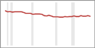
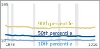
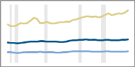
Table 1 provides graphic presentations of real hourly wages across different demographic groups from 1979 to 2016. The sample of workers examined includes nonfarm workers ages 25 to 64.
|
Demographic |
Real Wage Trends |
Cumulative % Change in Real Wage Levels over 1979-2016 |
||
|
Shaded Bars = Recessions |
10th percentile |
50th percentile |
90th percentile |
|
|
Overall |
|
-5.5% |
4.7% |
33.2% |
|
Men |
|
-16.8% |
-5.0% |
34.4% |
|
Women |
|
3.9% |
24.9% |
63.5% |
|
White (Non-Hispanic) |
|
4.5% |
11.6% |
37.3% |
|
Black (Non-Hispanic) |
|
-0.9% |
2.8% |
27.7% |
|
Non-Hispanic |
|
1.9% |
7.3% |
37.8% |
|
Hispanic |
|
-4.2% |
-9.3% |
12.2% |
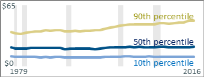
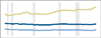
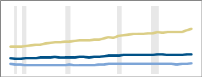

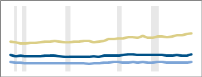
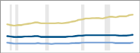

Source: CRS estimates using Current Population Survey Outgoing Rotation Group data for 1979-2016. Recession data are from the National Bureau of Economic Research, at http://www.nber.org/cycles.html.
Notes: Sample comprises nonfarm wage and salary workers who are 25-64 years old and provide sufficient information to compute an hourly wage. Periods of recession are shaded in gray. Dollar amounts are adjusted for inflation using the Bureau of Labor Statistics Current Price Index for All Urban Consumers (CPI-U); https://www.bls.gov/cpi/. All graphics use the same scale: $0-$65 hourly wage on vertical axis, and years 1979-2016 on the horizontal axis.
Wages at the 90th percentile increased across demographic groups, ranging from rates of 12.2% (Hispanic workers) to 63.5% (women). Overall, wages at the 90th percentile increased from an estimated $36.75 to $48.95 (a 33.2% increase) over the 37 years between 1979 and 2016, but the growth rate was not constant. After increasing by $3.00 ($36.75 to $39.75) over the 19 years from 1979 to 1998, wages at the 90th percentile grew by an estimated $9.20 over the 18 years from 1998 to 2016.11
Median wage trends were not uniform across demographic groups, with wages decreasing for men but increasing for women. Overall, median wages increased from an estimated $19.84 to $20.77 (a 4.7% increase) over the 1979 to 2016 period. On the other hand, wages at the 10th percentile fell in real terms across nearly all demographic groups, with the exception of white women (see Figure 2). Overall, the wages at the 10th percentile declined in real terms from an estimated $10.58 to $10.00 (a 5.5% decrease).
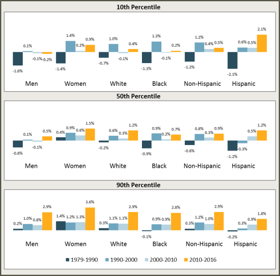
To explore how real wage trends evolved over the 1979 to 2016 period, Figure 1 shows annualized wage growth rates over various time periods (roughly a decade each) by wage percentile and demographic group. Considering first wage growth at the 10th and 50th percentiles, Figure 1 reveals that the 10th percentile wage declined in real terms during the 1980s for all groups, and with the exception of women, the median (50th percentile) wage declined as well. In the 1990s, 10th percentile and median wages increased for nearly all demographic groups. This was followed by a slowdown in real wage growth in 2000-2010, after which 10th percentile wages grew for nearly all demographic groups (with the exception of men), and median wages increased. Real wage growth at the 90th percentile was positive and increasing over time for all demographic groups excluding black workers and Hispanic workers, for whom the 90th percentile wage declined slightly during one period, the 1980s. Notably, looking at the 1979 to 2016 period overall, of the groups in Figure 1 only male workers at the 10th percentile did not see wage recovery after the across-the-board declines of the 1980s.
|
Figure 1. Annualized Real Wage Growth by Percentile and Demographic |
 |
|
Source: CRS estimates using Current Population Survey Outgoing Rotation Group data for 1979-2016. Notes: Sample comprises nonfarm wage and salary workers who are 25-64 years old and provide sufficient information to compute an hourly wage. Dollar amounts are adjusted for inflation using the Bureau of Labor Statistics Current Price Index for All Urban Consumers (CPI-U); https://www.bls.gov/cpi/. |
Wage Trends for Low, Middle, and High Earners by Sex, Race, Ethnicity, and Educational Attainment
Aggregate trends and overall averages can mask important dynamics within groups. For example, although women in aggregate saw sizable wage gains across the 10th, 50th, and 90th percentiles from 1979 to 2016, the trends and growth rates varied considerably between black and white women and between Hispanic and non-Hispanic women.12 Similar variation occurs within other demographic groups. Further, comparing rates of change can be misleading because worker groups start (in 1979) at different base wages.13 For example, women's wage growth over 1979-2016 at the median was 25%, compared to a 5% wage loss experienced by men at the median. However, the median wage for women in 2016 was still lower than the male median wage in the same year.
This section explores these patterns by disaggregating the major trends in real hourly wages by sex, race, and Hispanic ethnicity; these are presented in Figure 2, below. The discussion is organized by earner group—low wage (10th percentile), median wage (50th percentile), and high wage (90th percentile). It bears repeating that the data used to analyze wage trends are cross-sectional, and as such do not capture individuals' movements between earner groups (e.g., an individual worker may move from a lower to higher earnings group over time, or vice versa). In general, the direction of change tended to be consistent within wage group (e.g., nearly all demographic categories at the 10th percentile saw falling wages from 1979 to 2016), but the magnitudes of change and the wage levels varied by demographic.14
Low-Wage Workers
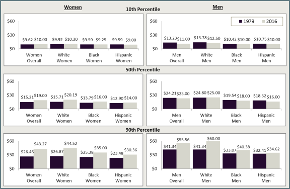
With the exception of white women, wages at the 10th percentile fell in real terms over 1979-2016 for all low-wage worker groups, although the degree of loss varied by gender and race. In 1979, wages in the 10th percentile ranged from $9.59 for black and Hispanic women to $13.78 for white men, whereas in 2016 wages in the 10th percentile ranged from $9.00 for Hispanic women to $12.50 for white men.
Men's wages at the 10th percentile fell by 16.8% ($13.23 to $11.00) from 1979 to 2016. Within the group of low-wage male earners, however, white men experienced the largest percentage decline from 1979 to 2016, a drop of 9.3% ($13.78 to $12.50), followed by 7.0% for Hispanic men ($10.75 to $10.00), and by 4.0% for black men ($10.42 to $10.00).
Women's wages at the 10th percentile rose by 3.9% from 1979 to 2016, from $9.62 to $10.00. When looked at by race and ethnicity, it appears that the overall improvement in wages among low-wage women was driven by the small gains (3.8%) in hourly earnings for white women ($9.92 to $10.30). For low-wage black women, 10th percentile wages fell by 3.6% ($9.59 to $9.25), and for low-wage Hispanic women the decline was 6.2% ($9.59 to $9.00).
Middle-Wage Workers
Wage trends at the median (50th percentile) diverged sharply between men and women from 1979 to 2016. Overall, median wages for men fell by 5.0% but rose by 24.9% for women. In 1979, median wages ranged from $12.90 for Hispanic women to $24.80 for white men, whereas in 2016 median wages ranged from $14.00 for Hispanic women to $25.00 for white men.
Whereas median wages for white men rose slightly (by 0.8%) from 1979 to 2016, from $24.80 to $25.00, median wages for black and Hispanic men fell. Median wages for black men fell by 7.9%, from $19.54 to $18.00, and for Hispanic men by 13.6%, from $18.52 to $16.00.
Median wages for white women had the largest increase at 28.5% ($15.71 to $20.19), whereas median wages for black women increased by 16.0% ($13.79 to $16.00) and for Hispanic women by 8.5% ($12.90 to $14.00).
High-Wage Workers
At the 90th percentile, wages grew across all groups, but the magnitude and levels varied by gender and race. Overall, wages for men at the 90th percentile rose by 34.4% and for women by 63.5%. In 1979, wages in the 90th percentile ranged from $23.48 for Hispanic women to $41.34 for white men, whereas in 2016 wages in the 90th percentile ranged from $30.36 for Hispanic women to $60.00 for white men.
Wages for white men at the 90th percentile rose by 45.1% from 1979 to 2016, from $41.34 to $60.00. Although wages at the 90th percentile for black and Hispanic men also rose over this period, they did not increase by as much. The 90th percentile wage for black men increased by 22.1% (from $33.07 to $40.38) and for Hispanic men by 6.8% ($32.41 to $34.62).
White women at the 90th percentile experienced the largest percentage increase in wages of any race or gender group in this study, with wages increasing by 65.7%, from $26.87 to $44.52. Among black women, the 90th percentile wage increased by 37.9%, from $25.38 to $35.00, and for Hispanic women the increase was 29.3%, from $23.48 to $30.36.
Wage Gaps
Differential wage growth over 1979 to 2016 affected wage inequality within and between demographic groups. The superior wage growth at the 90th percentile, alongside weaker growth or declining wages at the bottom half of the distribution, translated into growing wage inequality within all demographic groups, but groups varied by the degree of increased inequality. For example, the 10th percentile wage for men was 32.0% of the 90th percentile male wage in 1979; in 2016 this ratio fell to 19.8% (i.e., the 10th percentile wage moved further away from the 90th percentile wage over time). For Hispanic men the ratio also declined, but more modestly, from 33.2% (in 1979) to 28.9% (in 2016).15
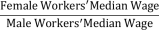
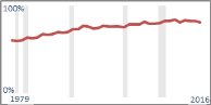
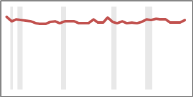
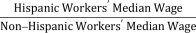
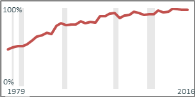
As measured at the median, strong wage growth among female workers and wage loss among men led to a narrowing of the gender wage gap (i.e., women's median wages as a share of men's median wages), from 62.8% to 82.6%. Other median wage differentials (Table 2) did not show similar narrowing, however. The wage gap between black and white workers grew, as did the gap between median-wage Hispanic workers and median-wage non-Hispanic workers.
|
Comparison Groups |
Ratio of Median Wages, |
1979 |
2016 |
|
|
|
62.8% |
82.6% |
|
|
|
88.2% |
84.2% |
|
|
|
80.6% |
68.2% |
Source: CRS estimates using Current Population Survey Outgoing Rotation Group data for 1979-2016. Recession data (in gray) are from the National Bureau of Economic Research, at http://www.nber.org/cycles.html.
Notes: Sample comprises nonfarm wage and salary workers who are 25-64 years old and provide sufficient information to compute an hourly wage. Periods of recession are shaded in gray. Dollar amounts are adjusted for inflation using the CPI-U. All graphics use the same scale: 0%-100% on vertical axis, and years 1979-2016 on the horizontal axis.
Wages by Educational Attainment: The College Premium
The rise in real hourly wages for workers with higher levels of educational attainment stands out among wage trends over the 1979 to 2016 period.16 Specifically, Table 3 shows the following:
- Among workers with a bachelor's or advanced degree, wages at the 10th, 50th, and 90th percentiles rose in real terms between 1979 and 2016, with increases of 4.7%, 14.4%, and 36.9%, respectively, suggesting rising demand for skilled workers or better bargaining conditions for them.
- Over the same period, wages declined markedly at the 10th, 50th, and 90th percentiles for workers with a high school diploma (or equivalent) or less education, suggesting increasingly few labor market opportunities for less-skilled workers or a decrease in wage bargaining power. Median wages for high-school-educated workers fell by 13.9%, whereas those for the 10th and 90th percentiles fell by 9.3% and 9.1%, respectively.
- The higher-education wage premium—measured here by percent difference between the median wage for bachelor's or advanced degree holders and the median wage for workers with a high school education or less—grew considerably from 1979 to 2000, from about 49.8% to 90.5%. The premium has remained high since that time, but the growth in the gap has slowed; the premium now stands at about 99.1%.
|
Education Group |
Real Wage Trends |
Cumulative % Change in Real Wage Levels over 1979-2016 |
||
|
Shaded Bars = Recessions |
10th percentile |
50th percentile |
90th percentile |
|
|
High School Degree or Less Education |
|
-9.3% |
-13.9% |
-9.1% |
|
College Degree Holders |
|
4.7% |
14.4% |
36.9% |
|
Higher-Education Wage Premium |
1979 |
2000 |
2016 |
|
|
The higher-education wage premium is the percentage difference between the median wage of bachelor's or advanced degree holders and the median wage among workers with a high school education or less. |
|
49.8% |
93.6% |
99.1% |
Source: CRS estimates using Current Population Survey Outgoing Rotation Group data for 1979-2016. Recession data (in gray) are from the National Bureau of Economic Research, at http://www.nber.org/cycles.html.
Notes: Sample comprises nonfarm wage and salary workers who are 25-64 years old and provide sufficient information to compute an hourly wage. Periods of recession are shaded in gray. Dollar amounts are adjusted for inflation using the CPI-U.
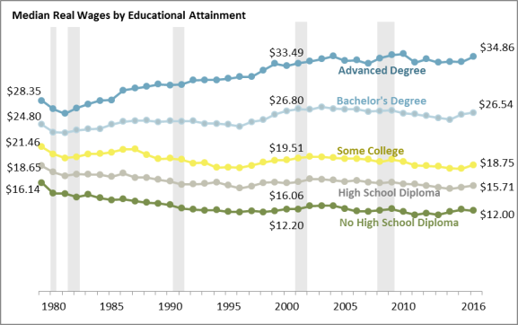
Figure 3 shows real median wages for workers at five different levels of educational attainment from 1979 to 2016—less than a high school degree, high school degree or equivalent, some college (including associate degrees and non-degree-holders with some college education), bachelor's degree, or advanced degree. The data show falling real median wages for workers with less than a bachelor's degree and rising wages for workers with at least a bachelor's degree. One commonality across all education groups is that most of the changes, increasing or decreasing real wages, occurred in the 1980s and 1990s, with slower changes occurring since about 2000 across groups. Specifically, Figure 3 shows the following:
- Workers with less than a high school degree saw a fall in median wages from $16.14 in 1979 to $12.20 in 2000 (a 24.4% decline) and $12.00 in 2016 (a 1.6% decline from 2000 to 2016).
- Workers with a high school degree also saw median wage declines, from $18.65 to $15.71 from 1979 to 2016. Similar to workers with less than a high school degree, most of this decline occurred from 1979 to 2000, when median wages fell by $2.59, to $16.06.
- The decline in median wages for workers with some college education was somewhat more muted than the decline for workers with a high school degree or less, falling from $21.46 in 1979 to $19.51 in 2000 to $18.75 in 2016. Thus, about three-quarters of the total decrease occurred in the 1980s and 1990s.
- Although workers with a bachelor's degree saw a 7.0% increase in median wages over the entire 1979 to 2016 period, from $24.80 to $26.54, this group did experience a slight decline from 2000 to 2016.
- Finally, for workers with education above a bachelor's degree, median wages increased by $6.51, or 23.0%, from 1979 to 2016. Median wages for this group, unlike the other groups, increased in the 2000 to 2016 period, albeit at a slower pace than before.
|
Figure 3. Median Wage by Educational Attainment Wages in 2016 $ |
 |
|
Source: CRS estimates using Current Population Survey Outgoing Rotation Group data for 1979-2016. Recession data (in gray) are from the National Bureau of Economic Research, at http://www.nber.org/cycles.html. Notes: Sample comprises nonfarm wage and salary workers who are 25-64 years old and provide sufficient information to compute an hourly wage. Periods of recession are shaded in gray. Dollar amounts are adjusted for inflation using the CPI-U. |
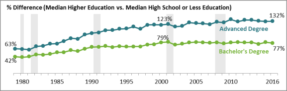
Figure 4 shows the higher-education premium, which is the percentage difference between the median wages received by workers with a bachelor's degree and those with an advanced degree (shown separately), and the median wage received by workers with a high school degree or less.17 Although the wage premium for workers with higher education rose in the 1979 to 2000 period, the premium has been flat since 2000 for workers with a bachelor's degree. For workers with advanced degrees, the wage premium continued to rise after 2000 but at a much slower rate than in the 1979 to 2000 period.
|
Figure 4. College Degree Wage Premium and Advanced Degree Wage Premium, Relative to a High School Education or Less |
 |
|
Source: CRS estimates using Current Population Survey Outgoing Rotation Group data for 1979-2016. Recession data (in gray) are from the National Bureau of Economic Research, at http://www.nber.org/cycles.html. Notes: Sample comprises nonfarm wage and salary workers who are 25-64 years old and provide sufficient information to compute an hourly wage. Periods of recession are shaded in gray. Dollar amounts are adjusted for inflation using the CPI-U. |
Skilled Trades
The previous section highlighted the strong wage growth experienced by workers with at least a bachelor's degree (relative to workers with a high school degree or less education) over the 1979 to 2000 period, and the high and sustained wage premium for these workers thereafter (see Figure 4). Such trends suggest elevated relative demand for skilled workers, whereas labor market conditions for less-skilled workers have become less favorable. Formal education is a common measure of worker skill, but it is not the only one. Workers can gain skills and expertise through nondegree postsecondary programs (e.g., certifications), apprenticeships, and on-the-job training (formally and informally acquired). Recent Bureau of Labor Statistics (BLS) data and projections point to strong and continuing demand for workers in this "middle-skill" range (i.e., education and/or training beyond high school but less than a college degree) in some occupations. For example, eight occupations that typically require less than a bachelor's degree for entry positions had median annual earnings in 2016 that were greater than the overall median of $37,040 and were projected by BLS to add the most jobs between 2016 and 2026 (Table 4).
Table 4. Occupations with High Employment Growth and High Earnings That Do Not Require a Bachelor's Degree
|
Occupation |
Typical Education Needed for Entry |
Typical On-the-Job Training |
Median Earnings (2016) |
Employment (2016) |
|
First-Line Supervisors of Retail Sales Workers |
High school diploma or equivalent |
None |
$39,040 |
1,532,400 |
|
Heavy and Tractor-Trailer Truck Drivers |
Postsecondary nondegree award |
Short-term on-the-job training |
$41,340 |
1,871,700 |
|
Carpenters |
High school diploma or equivalent |
Apprenticeship |
$43,600 |
1,025,600 |
|
Licensed Practical and Licensed Vocational Nurses |
Postsecondary nondegree award |
None |
$44,090 |
724,500 |
|
Plumbers, Pipefitters, and Steamfitters |
High school diploma or equivalent |
Apprenticeship |
$51,450 |
480,600 |
|
Sales Representatives, Services |
High school diploma or equivalent |
Moderate-term on-the-job training |
$52,490 |
983,000 |
|
Sales Representatives, Wholesale and Manufacturing |
High school diploma or equivalent |
Moderate-term on-the-job training |
$57,140 |
1,469,900 |
|
First-Line Supervisors of Construction Workers |
High school diploma or equivalent |
None |
$62,980 |
602,500 |
Source: Bureau of Labor Statistics Occupational Employment Projections, at https://www.bls.gov/emp/ep_data_occupational_data.htm.
Note: Median annual earnings across all occupations stood at $37,040 in 2016.
Worker Characteristics by Wage Group
Table 1 shows a general pattern of strong wage growth at the top of the wage distribution over the 1979 to 2016 period, with slower growth or falling wages at the median and bottom of the distribution. Although these patterns hold in general across demographic groups, there is considerable variation in the magnitudes and patterns of change across sex, race, and Hispanic ethnicity. For example, whereas both men and women experienced significant wage growth at the 90th percentile of their respective distributions, wage growth among female workers was nearly 30 percentage points higher than it was among men. And, although median wages for non-Hispanic workers rose over 1979 to 2016, median wages fell for Hispanic workers.
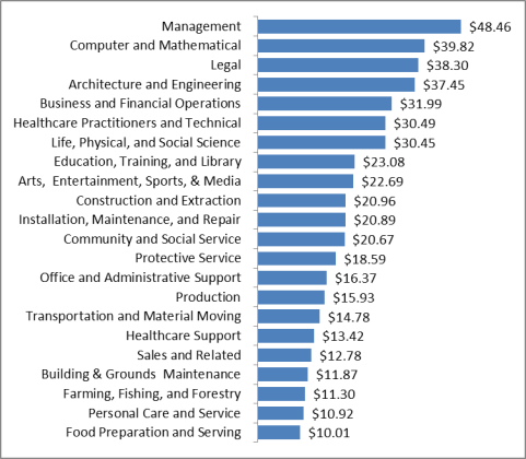
To better understand these cross-group differences, this section compares and contrasts workers' educational attainment and occupational distribution in 1979 and 2016.18 Because greater educational attainment generally has a positive relationship with wages (Figure 3), worker groups that have seen educational gains over 1979 to 2016 are more likely to have experienced wage gains than those that did not (or did to a lesser degree).19 Shifts in occupation may affect wage trends as well. Occupations require different mixes of skills and work experience, and where the workers meeting these requirements are scarcer, wages tend to be higher. The range of occupational wages is illustrated in Figure 5, which shows median hourly wages spanning $10.01 (food preparation and serving workers) to $48.46 (managers) in May 2016. As such, wages might grow faster for a demographic group that was more successful at shifting workers from low-paying to higher-paying occupations.20
 |
|
Source: Bureau of Labor Statistics, Occupational Employment Statistics, at http://www.bls.gov/oes/. |
The next three tables show data on education levels and broad occupation group of low-wage workers in 1979 and 2016 (Table 5), middle-wage workers in 1979 and 2016 (Table 6), and high-wage workers in 1979 and 2016 (Table 7). For the purposes of this portion of analysis, low-wage workers are those with wages at the 5th to 15th percentiles, middle-wage workers are those with wages at the 45th to 55th percentiles, and high-wage workers are those with wages at the 85th to 95th percentiles. The earnings groups are expanded by +/- five percentage points (in contrast to earlier analysis of workers at the 10th, 50th, and 90th percentiles) because this section describes the educational attainment and occupational composition of worker groups, and including more workers in each group allows for more precise estimate of education and occupational percentages. Overall, the analysis shows the following:
- For most groups, workers were more likely to have completed a bachelor's or advanced degree in 2016 than workers in 1979, with the gains in educational attainment being particularly large for workers in the highest wage group. The higher education level of low- and middle-wage workers in 2016, compared to 1979, is noteworthy in light of slightly rising or declining (depending on the specific demographic group) real wages over the 1979 to 2016 period; in general, wages tend to rise with education.
- Across all demographic and wage groups, workers lost employment shares in production work. Low-wage workers were concentrated in service jobs in 2016, whereas high-wage workers, to varying degrees, moved into managerial, executive, professional, and technical jobs. Occupational shifts for middle-wage workers differed across demographic groups.
The tables and discussion in this section describe worker characteristics by earnings group (low, middle, and high) in 1979 and 2016. As noted elsewhere, the data used in this report are cross-sectional and do not follow a fixed group of individuals over time. This means that the educational and occupational changes discussed below do not capture a set of individuals' education and job outcomes between 1979 and 2016, but the compositional change of workers in the three earner groups in these two years. For example, a rise in the share of college-degree holders in the middle-wage group does not necessarily reflect the share of middle-wage workers in 1979 that went on to complete a college degree.
Low-Wage Workers
Across demographic groups, low-wage workers increased their educational attainment between 1979 and 2016. In particular, the shares of workers who ended their schooling at or before high school graduation declined, and the shares of workers who completed some postsecondary education increased. Women in particular experienced strong gains in educational attainment, in absolute and relative terms. Over the 1979 to 2016 period, the shares of low-wage women with a bachelor's degree or higher rose from 4% to 14%, a rate on par with low-wage men in 2016. Concurrently, women's 10th percentile wages grew in real terms by 3.9% over the same period. But educational gains do not translate into wage growth for all groups. The share of low-wage male and black workers with increased education also rose from 1979 to 2016—albeit less than the gains compared to low-wage women—but these groups' wages at the 10th percentile fell in real terms, suggesting that other factors counterbalanced the upward pressure on wages typically generated by greater educational attainment.
The prominence of service occupations in 1979 and 2016 (30% and 35% of low-wage workers, respectively) and sharp decline in production jobs between 1979 and 2016 are noteworthy features of low-wage workers' occupational distribution.21 Service occupations command a range of wages, but many pay less at the median than production jobs (see Figure 5). All demographic groups have a lower percentage of workers in production occupations in 2016 compared to 1979. Notably, workers that experienced declining wages over the 1979 to 2016 period were those that mostly experienced an increased share of employment in service occupations (e.g., male and Hispanic workers). This suggests that occupational shifts may help explain wage trends for low-wage workers.
Middle-Wage Workers
Among middle-wage workers, all demographic groups, with the exception of Hispanic workers, made considerable gains in educational attainment over the 1979 to 2016 period. Shares of workers with a high school diploma or less schooling declined by 27 percentage points among men and 46 percentage points among women, and the shares of college degree holders increased as well.
In addition to educational gains, women's strong (24.9%) median wage growth over 1979 to 2016 may be related to marked occupational shifts over that period. In particular, middle-wage women moved from clerical and production jobs to higher-paying executive and managerial jobs, and to professional and technical occupations. Likewise, marked wage loss among Hispanic workers (who experienced a 9.3% decline at the median) occurred alongside modest changes in educational attainment and a 20 percentage point decline in production employment that was offset by gains in construction, service, and sales occupations.
High-Wage Workers
Although wage patterns varied across demographic groups for low-wage and middle-wage workers, wages grew in real terms at the 90th percentile for all groups over the 1979-2016 period. Education gains and heightened concentration of employment in executive and professional occupations appear to help explain strong wage growth. The strong performance of high-wage workers (i.e., at the 90th percentile of wages) suggests that labor market demand for skilled workers increased over the 1979-2016 period, or that this group otherwise improved its bargaining position over compensation.22 High-wage workers increased their educational attainment dramatically between 1979 and 2016, and—with the exception of Hispanic workers—were predominantly college degree holders in 2016. This finding for Hispanic workers should be put in the context of noteworthy compositional changes for this group. In particular, Pew Research Center reports that Hispanics are an increasingly diverse population, which may affect cross-time comparisons (i.e., differences in Hispanic worker characteristics in 2016 and 1979 may be greater than those for other work groups).23 Over the same period, high-wage workers became concentrated in executive, administrative, and managerial jobs and professional, technical, and related jobs, such that by 2016 these occupations represented more than 50% of employment in each group (more than 80% of employment when Hispanic workers are excluded from analysis).
Table 5. Low-Wage Workers' Educational Attainment and Occupation, by Selected Demographics, 1979 and 2016
|
Overall |
Male |
Female |
Black (Non-Hispanic) |
White (Non-Hispanic) |
Hispanic |
Non-Hispanic |
||||||||
|
1979 |
2016 |
1979 |
2016 |
1979 |
2016 |
1979 |
2016 |
1979 |
2016 |
1979 |
2016 |
1979 |
2016 |
|
|
Education |
||||||||||||||
|
High School Diploma or Less |
82% |
55% |
73% |
62% |
85% |
54% |
91% |
65% |
76% |
44% |
92% |
83% |
80% |
47% |
|
Some College |
12% |
30% |
14% |
25% |
11% |
31% |
7% |
30% |
14% |
36% |
4% |
11% |
13% |
35% |
|
Bachelor's Degree and Higher |
6% |
14% |
12% |
13% |
4% |
14% |
2% |
5% |
9% |
20% |
5% |
6% |
7% |
18% |
|
Occupation |
||||||||||||||
|
Executive, Administrative, and Managerial |
3% |
4% |
8% |
3% |
2% |
3% |
1% |
2% |
6% |
6% |
2% |
2% |
4% |
5% |
|
Professional, Technical, and Related |
6% |
10% |
8% |
6% |
6% |
11% |
4% |
6% |
9% |
14% |
4% |
3% |
7% |
11% |
|
Sales |
14% |
13% |
6% |
9% |
19% |
19% |
5% |
14% |
12% |
13% |
10% |
10% |
14% |
15% |
|
Administrative Support, Including Clerical |
18% |
14% |
7% |
11% |
15% |
16% |
6% |
12% |
28% |
20% |
7% |
8% |
20% |
19% |
|
Service |
30% |
35% |
19% |
28% |
36% |
41% |
50% |
48% |
20% |
24% |
33% |
46% |
29% |
31% |
|
Construction and Extraction |
2% |
4% |
8% |
10% |
NA |
NA |
4% |
NA |
2% |
2% |
4% |
6% |
2% |
2% |
|
Installation, Maintenance, and Repair |
1% |
2% |
7% |
5% |
NA |
NA |
1% |
1% |
1% |
2% |
2% |
3% |
1% |
2% |
|
Production |
19% |
10% |
20% |
10% |
20% |
6% |
20% |
9% |
16% |
9% |
32% |
11% |
17% |
7% |
|
Transportation and Material Moving |
6% |
9% |
16% |
18% |
3% |
4% |
9% |
7% |
6% |
8% |
7% |
11% |
6% |
9% |
Source: CRS estimates using Current Population Survey Outgoing Rotation Group data for 1979-2016.
Notes: "Low-wage workers" refers to workers at the 5th-15th percentiles of their respective wage distribution. "NA" indicates an estimated percentage of less than 1%.
Table 6. Middle-Wage Workers' Educational Attainment and Occupation, by Selected Demographics, 1979 and 2016
|
Overall |
Male |
Female |
Black (Non-Hispanic) |
White (Non-Hispanic) |
Hispanic |
Non-Hispanic |
||||||||
|
1979 |
2016 |
1979 |
2016 |
1979 |
2016 |
1979 |
2016 |
1979 |
2016 |
1979 |
2016 |
1979 |
2016 |
|
|
Education |
||||||||||||||
|
High School Diploma or Less |
60% |
30% |
60% |
33% |
68% |
22% |
70% |
33% |
57% |
24% |
79% |
79% |
59% |
24% |
|
Some College |
19% |
32% |
21% |
32% |
20% |
35% |
19% |
39% |
20% |
30% |
8% |
14% |
20% |
30% |
|
Bachelor's Degree and Higher |
21% |
38% |
20% |
35% |
12% |
43% |
11% |
29% |
23% |
46% |
13% |
7% |
21% |
46% |
|
Occupation |
||||||||||||||
|
Executive, Administrative, and Managerial |
11% |
15% |
13% |
14% |
7% |
16% |
4% |
11% |
12% |
18% |
5% |
6% |
11% |
18% |
|
Professional, Technical, and Related |
20% |
26% |
15% |
19% |
15% |
30% |
14% |
17% |
22% |
31% |
8% |
7% |
21% |
28% |
|
Sales |
5% |
7% |
5% |
9% |
5% |
8% |
3% |
6% |
5% |
7% |
3% |
8% |
5% |
8% |
|
Administrative Support, Including Clerical |
20% |
17% |
8% |
8% |
44% |
33% |
22% |
21% |
19% |
14% |
16% |
17% |
19% |
17% |
|
Service |
7% |
9% |
6% |
9% |
10% |
8% |
19% |
17% |
6% |
7% |
13% |
20% |
6% |
6% |
|
Construction and Extraction |
5% |
6% |
6% |
9% |
NA |
NA |
5% |
2% |
5% |
5% |
9% |
17% |
5% |
4% |
|
Installation, Maintenance, and Repair |
5% |
5% |
9% |
9% |
NA |
NA |
2% |
4% |
6% |
5% |
5% |
5% |
6% |
5% |
|
Production |
19% |
9% |
26% |
11% |
15% |
3% |
20% |
7% |
18% |
7% |
29% |
9% |
19% |
7% |
|
Transportation and Material Moving |
8% |
7% |
11% |
12% |
2% |
2% |
11% |
14% |
7% |
5% |
12% |
11% |
8% |
7% |
Source: CRS estimates using Current Population Survey Outgoing Rotation Group data for 1979-2016.
Notes: "Middle-wage workers" refers to workers at the 45th-55th percentiles of their respective wage distribution. "NA" indicates an estimated percentage of less than 1%.
Table 7. High-Wage Workers' Educational Attainment and Occupation, by Selected Demographics, 1979 and 2016
|
Overall |
Male |
Female |
Black (Non-Hispanic) |
White (Non-Hispanic) |
Hispanic |
Non-Hispanic |
||||||||
|
1979 |
2016 |
1979 |
2016 |
1979 |
2016 |
1979 |
2016 |
1979 |
2016 |
1979 |
2016 |
1979 |
2016 |
|
|
Education |
||||||||||||||
|
High School Diploma or Less |
40% |
6% |
35% |
7% |
40% |
4% |
52% |
8% |
40% |
6% |
65% |
42% |
39% |
6% |
|
Some College |
20% |
15% |
19% |
13% |
22% |
15% |
22% |
23% |
20% |
13% |
9% |
27% |
20% |
13% |
|
Bachelor's Degree and Higher |
40% |
79% |
46% |
80% |
38% |
81% |
26% |
69% |
40% |
80% |
26% |
31% |
41% |
81% |
|
Occupation |
||||||||||||||
|
Executive, Administrative, and Managerial |
23% |
34% |
27% |
36% |
13% |
33% |
10% |
30% |
24% |
35% |
12% |
24% |
23% |
35% |
|
Professional, Technical, and Related |
28% |
46% |
28% |
43% |
40% |
52% |
20% |
41% |
27% |
44% |
14% |
30% |
28% |
47% |
|
Sales |
5% |
7% |
7% |
8% |
6% |
5% |
2% |
4% |
6% |
8% |
3% |
6% |
5% |
7% |
|
Administrative Support, Including Clerical |
7% |
3% |
5% |
2% |
29% |
7% |
14% |
7% |
7% |
3% |
12% |
9% |
7% |
3% |
|
Service |
2% |
3% |
2% |
3% |
3% |
2% |
6% |
6% |
2% |
3% |
6% |
8% |
2% |
3% |
|
Construction and Extraction |
12% |
3% |
12% |
3% |
0% |
NA |
7% |
2% |
12% |
3% |
14% |
11% |
12% |
2% |
|
Installation, Maintenance, and Repair |
6% |
1% |
4% |
1% |
1% |
NA |
7% |
2% |
5% |
1% |
8% |
4% |
5% |
1% |
|
Production |
12% |
1% |
11% |
2% |
7% |
NA |
20% |
2% |
12% |
1% |
22% |
4% |
12% |
1% |
|
Transportation and Material Moving |
6% |
1% |
4% |
2% |
2% |
NA |
14% |
5% |
5% |
1% |
7% |
4% |
6% |
1% |
Source: CRS estimates using Current Population Survey Outgoing Rotation Group data for 1979-2016.
Notes: "High-wage workers" refers to workers at the 85th-95th percentiles of their respective wage distribution. "NA" indicates an estimated percentage of less than 1%.
Factors Affecting Wage Trends
This section briefly describes some of the major factors believed to affect wage trends. A full discussion of these factors, and the empirical evidence associated with different causal factors, is beyond the scope of this report. Rather, several of the primary mechanisms that are thought to contribute to wage growth or stagnation are outlined. In many cases, individual wages are likely determined by the interaction of several forces, such as workers' skills and their value to employers, job match quality, and relative bargaining power. Broadly speaking, these factors can be grouped into two categories: market factors (affecting the supply of and demand for workers) and institutional factors (affecting rules governing compensation). Over time, changes in these factors for various groups (e.g., in education and training investment, employers' demand for workers with certain skills, and institutions that govern wage bargaining), along with macroeconomic growth, play a role in shaping the wage gains or losses for those groups.
Market Factors
Workers come to labor markets—often local labor markets—with varying levels of human capital—collections of skills and experience, abilities, and other job-relevant attributes –where they match with employers seeking to hire certain types of workers. Some jobs require specialized skills and training (e.g., medical practitioners, skilled crafts like carpentry), whereas others can be performed by most workers of any skill level. For example, most workers could operate a cash register or perform simple building maintenance tasks with cursory on-the-job training. Employers are generally willing to pay more to skilled workers for two reasons. First, skilled workers come to the job with the required human capital to be productive and thus are well-positioned to help generate higher revenues for the firm. Second, because skilled workers are relatively scarce, employers offer higher wages to attract them away from other firms. To the extent that workers' skill sets become more valuable to employers over time or more scarce, wages should rise, and vice versa.
Technological change, international trade, immigration and other factors affecting labor supply changes, along with the quality of job matches are among the key market factors thought to contribute to recent wage trends. We describe these forces briefly here; a more detailed discussion is in CRS Report R44705, The U.S. Income Distribution: Trends and Issues, by [author name scrubbed], [author name scrubbed], and [author name scrubbed].
Technological change can affect wage patterns by changing employers' demand for certain groups of workers.24 Where new technology raises workers' productivity (often for high-skilled workers)—and their value to employers—demand will rise, and put upward pressure on wages. At the same time, technological progress has reduced demand where workers' effort can be replaced by automation or information technology.25 Moreover, technological improvements can further affect employers' demand for certain workers by increasing the feasibility of offshoring (i.e., moving production outside the United States) certain production tasks and services that do not need to be performed in proximity to the consumer (e.g., book-keeping, call-center activities).
Recent global trading patterns have altered what goods and services the United States produces, and thereby the demand for labor to carry out that production. For example, the long-term decline in U.S. manufacturing employment, which lasted through the end of the Great Recession, has led a number of researchers to investigate the extent to which the decline is caused by increased import penetration in manufacturing, which can easily be traded. Recent studies focus on the impacts of China's establishment (starting in 2000) as a global supplier of manufactured goods.26 Increased international competition—and particularly from China—is among factors that contributed to factory closings and production shifts that displaced large numbers of U.S. workers. It had additional employment consequences for firms that provided inputs and support services to the manufacturing sector (e.g., suppliers of raw materials, delivery services, warehousing), and affected economic conditions in surrounding communities.
Changes to labor supply over time will also influence wages, at least in the short term. Public attention often centers on the supply effect of immigration, but other economic changes can shift the supply of labor as well. For example, social and economic change dramatically increased women's labor supply in the latter half of the last century. In addition, other policy mechanisms, such as changes in income tax rates or changes affecting the payoff to labor (e.g., the Earned Income Tax Credit) can influence the labor supply of targeted groups of workers. The labor market effects of immigration comprise a large and complex area of economic research.27 Economic theory produces a range of possible outcomes that depend on the characteristics of incoming immigrant workers and how they compare to a country's existing pool of labor, the degree to which new immigrants and existing workers compete for jobs in the same labor markets, how employers respond to the new labor supply, macroeconomic considerations, and other factors. That said, a large influx of a particular worker group (e.g., low skilled workers) translates into an increase in labor supply, and could lower wage offers in the short run.
The quality of a job match (i.e., the suitability of a particular worker to a particular job) matters to wages as well. Job search is costly for both workers and employers, and sometimes workers accept less-than-optimal jobs (or employers make job offers to suboptimal candidates) to minimize search costs. Factors affecting job match quality include workers' information about job openings (e.g., the existence of vacancies, job attributes and how they align with worker preferences), employers' ability to locate jobseekers and accurately assess worker qualifications, and geographic mobility. Better job matches increase workers' value, and to the extent that workers can bargain effectively for a portion of that improvement, wages rise.
Institutional Factors
Labor market institutions are the set of formal and informal rules that govern compensation, and include the minimum wage, the strength and structure of labor unions, and employment practices that affect workers' ability to bargain over compensation. Changes to institutions over time can therefore affect wage trends as well.
Minimum wages may affect wage growth through two primary channels. First, and most directly, minimum wages set a floor for low-wage workers. Second, to the extent that employers maintain wage differentials between the lowest-wage workers and those higher in the wage distribution, minimum wage increases may affect both minimum wage workers and those with earnings above those levels. Minimum wage earners may see declines in real wages to the extent that the minimum wage is not increased, or increases do not keep pace with inflation. The federal minimum wage, for example, was not increased from 1981 through 1989, thus falling in real value for nearly a decade. Recent evidence suggests that the decline in the real value of the federal minimum wage in the 1980s played a moderate role in increasing the wage gap between low and middle earners.28
Changes in unionization, employment policies, and workplace organization can affect workers' relative bargaining power and influence wage growth. For example, the evidence of a "union wage premium" suggests that, other factors being equal, union members have higher wages compared to nonunion members. Empirical evidence indicates that the private-sector union wage premium is in the 10%-20% range.29 However, over time these gains apply to a shrinking pool of workers, as the union membership rate declined from 20.1% in 1983 to 10.7% in 2016, with much of that decline in the private sector. As such, empirical work in this area has suggested that the decline in unionization contributed to stagnating wages and rising inequality, particularly in the 1980s.30 These effects are particularly meaningful for middle-wage workers and for men, because traditionally male "blue collar" jobs, such as manufacturing and construction, had higher unionization rates.
The use of employment policies to restrict firms' competition for workers may affect wages by limiting workers' relative bargaining power. Many workers achieve wage gains by changing jobs. The gains associated with job mobility (i.e., movement between jobs) are therefore restricted, plausibly, where franchise agreements include provisions that prohibit employers from hiring workers from other firms affiliated with the same franchisor (i.e., no-poach or no-hire provisions) or where employment contracts include provisions restricting workers from accepting job offers from firms in the same industry (i.e., noncompete clauses). A recent study of no-poach provisions in franchise contracts found that 58% contained some restriction on franchisees' ability to recruit and hire workers from other firms within the franchise system.31
In addition, a movement toward greater use of contractors and subcontractors in some industries has, by some accounts, reduced the bargaining power of certain worker groups (e.g., lower-paid workers in service occupations) and put downward pressure on their wages.32 For example, many companies that traditionally employed their own janitorial staff now obtain cleaning and maintenance services through a separate vendor. Although such restructuring can be beneficial in terms of efficiency gains, this workplace movement also disassociates workers from the general pay schedule of the industry and from large firms more specifically. Such workplace models (e.g., service contractors not part of the core business for which they are providing services) operate in highly competitive markets, which puts pressure on employers to keep operating costs (including labor costs) low, and poses greater challenges for union organizing.
At the same time, changes in pay-setting practices in certain high-pay occupations, the emergence of superstar earners (e.g., in sports and entertainment), and other factors may have improved wage growth for some workers at the top of the wage distribution.33
Macroeconomic Factors
In general, aggregate employment increases with economic growth. This occurs because as innovations bring new and better products to market, consumer demand for goods and services rises, and all things equal, so does employment.34 Macroeconomic forces can also affect employment through changes on the production side (i.e., by changing the costs of producing goods and services). In the long run, labor productivity (i.e., output produced per hour of labor) and wages tend to move together, as lower production costs cause firms to expand production and increase their demand for labor. The degree to which greater demand for workers translates into growth in aggregate earnings (i.e., the sum of all workers' earnings across the workforce) and the distribution of those earnings among workers depends on variety of factors, including market and institutional factors discussed above, and overarching macroeconomic forces. A growing gap between labor productivity and compensation35 and the related decline in labor's share of gross domestic income (GDI) from 57.2% of GDI in 1979 to 53.2% of GDI in 2016,36 suggests a shift in these forces such that national income growth translates into lower growth in aggregate earnings than in the past.37
Similarly in times of economic recession, private sector demand for goods and services declines, putting strain on the labor market. Employment levels fall and high unemployment rates (together with declining revenues) put downward pressure on overall wage growth. Countervailing that pressure is a tendency of employers to retain their most productive workers, which affects both the composition of the workforce (i.e., who remains after layoffs) and creates an incentive for workers to increase effort and productivity to avoid a layoff.38 Macroeconomists also observe that middle-skill workers experience relatively higher job loss during recession, which may further contribute to differential wage growth because displaced workers tend to reenter the labor market at lower wage levels and may increase competition for other jobs held by middle- and lower- skilled workers. Although difficult to observe in aggregate wage statistics, research based on microeconomic data indicates wages tend to fall during recessions and rise during recoveries (i.e., wages are procyclical), although the wage response appears to vary from recession to recession.39
Appendix A. Data Used in this Report
The data used to create annual hourly wage distributions over the 1979-2016 period are from the Current Population Survey (CPS) Outgoing Rotation Groups (ORGs). The CPS is a large-scale household survey conducted monthly by the Census Bureau. CPS participants are interviewed for four consecutive months, then leave the survey for eight months, when they reenter the survey for a final four months. The ORGs are made up of respondents completing their fourth month in the survey (i.e., before they go out on an eight-month hiatus) and those completing their eighth and final interview. Unlike other groups, the ORGs are asked about their usual earnings and hours worked, making them a particularly useful sample for hourly wage studies.
Our sample comprises individuals 25 to 64 years old who were employed in nonfarm, nonmilitary wage and salary jobs during the survey week and reported enough information to compute an hourly wage. Excluded from our sample are self-employed workers, Armed Forces members, workers in agricultural occupations, and workers whose wages were imputed by the Census Bureau. As others have done, we exclude Census-imputed wages due to the finding by Hirsch and Schumacher (2002) that a large portion of them were imputed with error.40
We estimate hourly wages by dividing workers' reported usual weekly earnings by their usual weekly hours of work. For workers who report they are paid by the hour, we use their reported hourly rate of pay. Wages represent earnings before deductions. For workers who are not paid by the hour (non-hourly workers), wages include tips, overtime pay, and commissions. Unfortunately, this information on overtime, tips, and commissions is not collected for hourly workers before 1994 and is therefore not included in our hourly wage estimates for them.41 Wages are weighted by the product of a worker's CPS weight and their weekly hours (i.e., wages are hours-weighted).
CPS earnings data are "top-coded"—that is, any reported earnings above a given top-code value are replaced with the top-code value—to reduce the likelihood that any particular survey respondent can be identified in the data. In 1979, the first year of data, weekly earnings are top-coded at $999 per week. The top-code changes twice over the 1979-2016 period: it was raised to $1,923 per week in 1989 and to $2884.61 per week in 1998. Although necessary to maintain the anonymity of survey respondents, top-coding is problematic to studies that attempt to characterize the wage distribution on a year-by-year basis, because the wage distribution is not observable above the top-code value, and the top-code value changes over time. Researchers have addressed top-coded values using a variety of methods. We follow the Center for Economic and Policy Research's method by modeling earnings as having a log-normal distribution and replacing top-coded values with gender-specific estimates of the mean value of weekly earnings above the top-code value.42
Following standard practice, we address wage outliers (i.e., implausibly low or high wage reports) by excluding wages that are less than $0.50 in 1989 dollars and greater than $150 in 1989 dollars. Hourly wages were converted to 2016 dollars using the Consumer Price Index for All Urban Consumers, U.S. City Average (CPI-U). The CPI-U, which is a measure of the average change over time in prices paid by consumers for a market basket of goods and services, is commonly used to compare the real (inflation-adjusted) value of earnings or spending data at different points in time. The CPI-U, for example, is the most common index used to adjust state minimum wage rates.
Appendix B. Demographic and Occupational Composition of the Wage Distribution in 1979 and 2016
This report has looked at wage trends by demographic group and earner category, and worker characteristics within those groups. For example, the median wage for women in a given year is defined with respect to the distribution of women's wages (not the overall wage distribution). Table B-1 explores the interaction between demographic groups and earnings from a different perspective. It describes the composition of the workforce overall and within the bottom, middle, and top third of the overall wage distribution.
Overall, the workforce was more diverse in 2016 than it was in 1979 (i.e., the share of white workers and non-Hispanic workers decreased), and the sex composition more balanced. In 2016, workers were older and better educated (i.e., a higher share of workers with at least a bachelor's degree). The share of workers in production jobs fell sharply between 1979 and 2016 (with losses in other job categories as well, such as administrative support and clerical work), with gains in employment share in many categories—the largest gains being in professional, technical, and related occupations.
These compositional changes did not all occur, however, to the same degree in each third of the overall wage distribution. For example, black workers remained overrepresented in the bottom 66% (i.e., bottom third and middle third) of the distribution; the share of black workers in the top third of wage earners did not change between 1979 and 2016. Similarly, although female workers and Hispanic workers gained shares in the upper wage tercile (i.e., top third), they remained underrepresented among top earners in 2016.
In terms of shifting occupational composition, from 1979 to 2016
- in the bottom third of the wage distribution, the share of workers in production work declined by 9 percentage points and in administrative support and clerical jobs by 7 percentage points. Over the same period, workers in the bottom third became more concentrated in service-sector employment (24% to 29%).
- in the middle wage tercile, the share of workers in production work declined by 11 percentage points and in administrative support work by 3 percentage points. On the other hand, workers in this tercile increased their share of employment by 7 percentage points in professional, technical, and related jobs, and by 5 percentage points in executive, administrative, and managerial occupations.
- in the top third of the wage distribution, the share of workers in executive, administrative, and managerial occupations and professional, technical, and related jobs increased from 44% in 1979 to 73% in 2016.
|
Overall |
Bottom Third |
Middle Third |
Top Third |
|||||
|
|
1979 |
2016 |
1979 |
2016 |
1979 |
2016 |
1979 |
2016 |
|
Race |
||||||||
|
White |
87% |
79% |
83% |
76% |
88% |
81% |
92% |
82% |
|
Black |
10% |
11% |
14% |
15% |
10% |
11% |
6% |
6% |
|
Other |
2% |
9% |
3% |
9% |
2% |
7% |
2% |
11% |
|
Hispanic Ethnicity |
||||||||
|
Non-Hispanic |
95% |
86% |
93% |
78% |
95% |
88% |
97% |
93% |
|
Hispanic |
5% |
14% |
7% |
22% |
5% |
12% |
3% |
7% |
|
Sex |
||||||||
|
Male |
56% |
51% |
30% |
44% |
59% |
52% |
83% |
60% |
|
Female |
44% |
49% |
70% |
56% |
41% |
48% |
17% |
40% |
|
Age |
||||||||
|
25-34 years |
40% |
30% |
40% |
37% |
45% |
30% |
34% |
20% |
|
35-44 years |
25% |
26% |
24% |
24% |
24% |
26% |
29% |
30% |
|
45-54 years |
21% |
25% |
21% |
21% |
19% |
25% |
23% |
30% |
|
55-64 years |
14% |
19% |
16% |
17% |
13% |
18% |
13% |
21% |
|
Education |
||||||||
|
High School Diploma or Less |
61% |
31% |
77% |
51% |
60% |
28% |
45% |
10% |
|
Some College |
18% |
28% |
14% |
31% |
20% |
32% |
20% |
19% |
|
Bachelor's Degree and Higher |
21% |
41% |
9% |
18% |
20% |
40% |
35% |
70% |
|
Occupation |
||||||||
|
Executive, Administrative, and Managerial |
12% |
17% |
5% |
6% |
11% |
16% |
20% |
31% |
|
Professional, Technical, and Related |
17% |
26% |
9% |
11% |
19% |
26% |
24% |
42% |
|
Sales |
7% |
9% |
9% |
11% |
5% |
7% |
5% |
7% |
|
Administrative Support, Including Clerical |
18% |
13% |
23% |
16% |
20% |
17% |
10% |
6% |
|
Service |
12% |
15% |
24% |
29% |
7% |
9% |
3% |
4% |
|
Construction and Extraction |
5% |
5% |
2% |
5% |
5% |
6% |
8% |
4% |
|
Installation, Maintenance, and Repair |
5% |
3% |
2% |
3% |
6% |
5% |
7% |
2% |
|
Production |
18% |
7% |
18% |
9% |
19% |
8% |
15% |
3% |
|
Transportation and Material Moving |
7% |
6% |
7% |
9% |
8% |
7% |
7% |
2% |
Source: CRS estimates using Current Population Survey Outgoing Rotation Group data for 1979 and 2016.
Notes: Sample comprises nonfarm wage and salary workers who are 25-64 years old and provide sufficient information to compute an hourly wage. Dollar amounts are adjusted for inflation using the CPI-U.